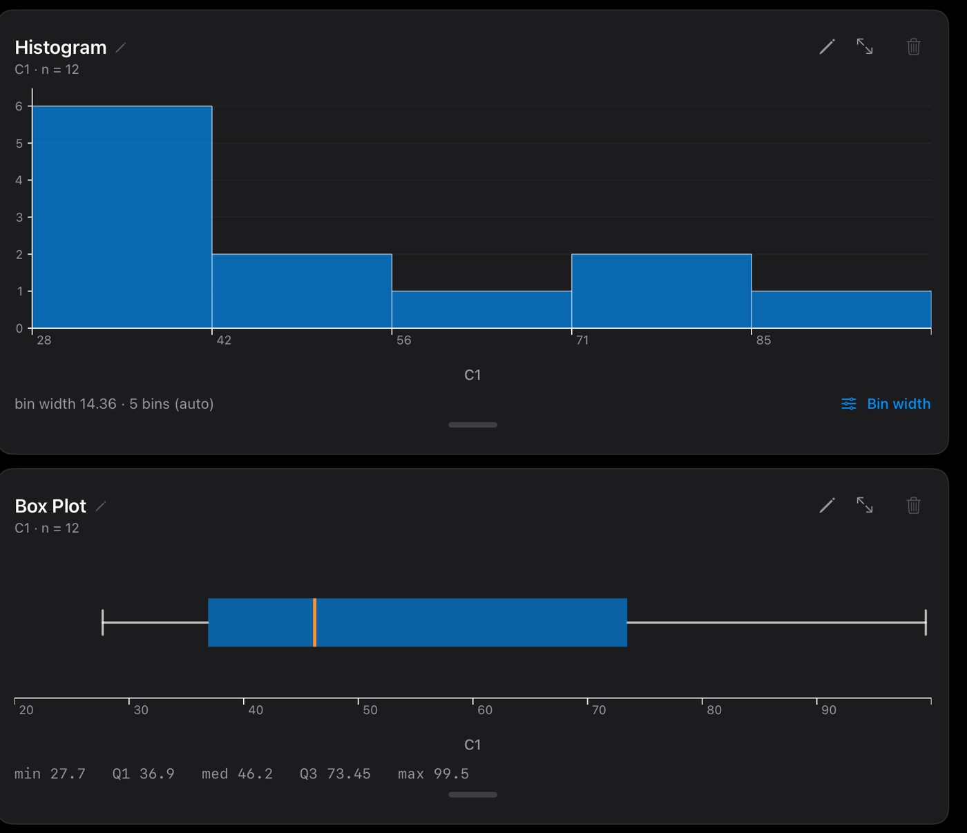
Histograms and box plots from your data, with the five-number summary spelled out.
StatGlyph is a scientific calculator built around a statistics course. Every answer arrives with the steps that produced it: the formula, the substitution, the curve, and the table row it came from.
Built by a university mathematics instructor after three decades of teaching statistics, for students who deserve more than a bare decimal.
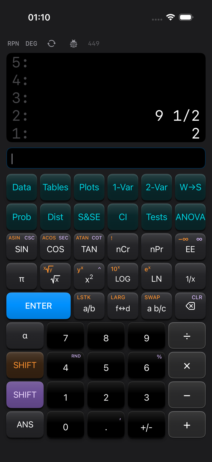
The iPhone calculator face. That first entry is a mixed number — 9 ½ — typed with the a b/c key, the way it is written on paper.
Ask an ordinary calculator for a standard deviation and you get 8.7758. StatGlyph gives you the same number at the end of the worked example: the mean as a fraction, a table with every deviation and its square, the sums, the formula with your numbers substituted in, and the boxed answer — typeset the way it appears in your textbook.
It is the difference between being handed a number and being shown how the number happened. For a student checking homework, the card is the homework.
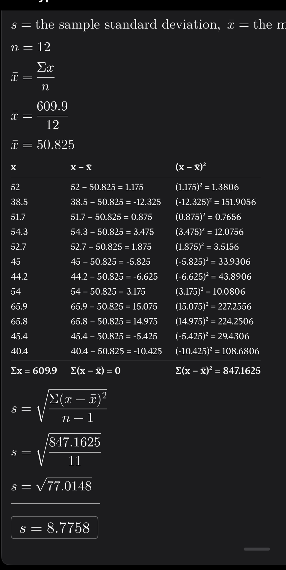
One tap on Standard Deviation: the entire computation, worked.
On iPhone, turn the phone sideways and the calculator face flips to the results feed — a running record of the problems you have worked, each one a small worked example.
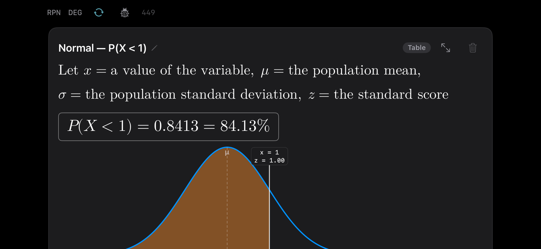
The results feed on iPhone: definitions, the boxed answer, and the shaded curve.
Ask for P(X > 0.35) and the card draws the curve with the region shaded, states the answer in context, and lays the z-table underneath with the row and column highlighted — so students see that the graph, the probability, and the table entry are three views of the same fact, not three separate skills to memorize.
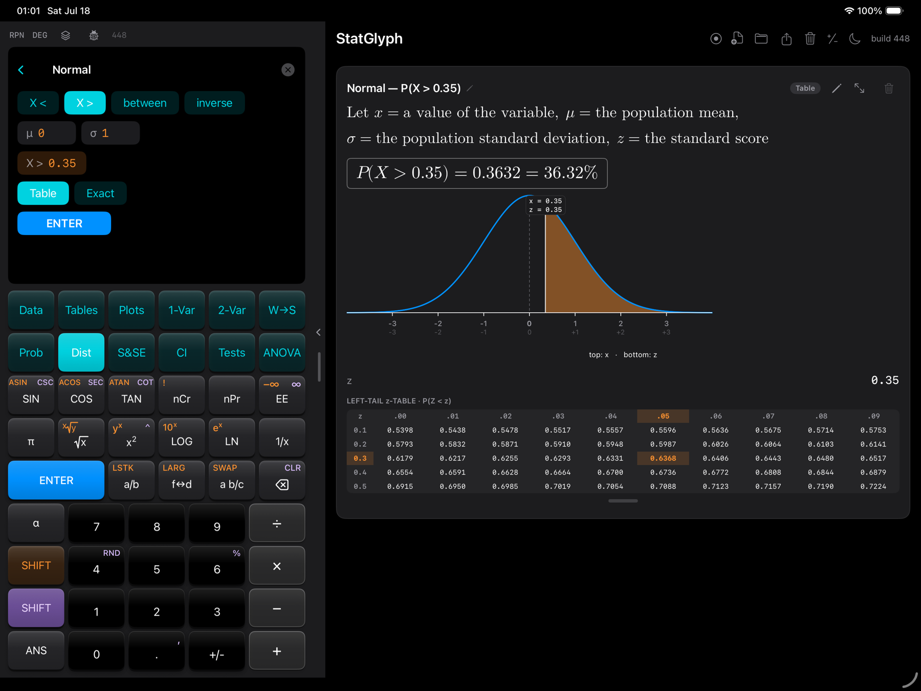
P(X > 0.35) = 36.32%: the shaded right tail, and the z-table with its row and column lit.
Histograms and box plots from your data, with the five-number summary spelled out.
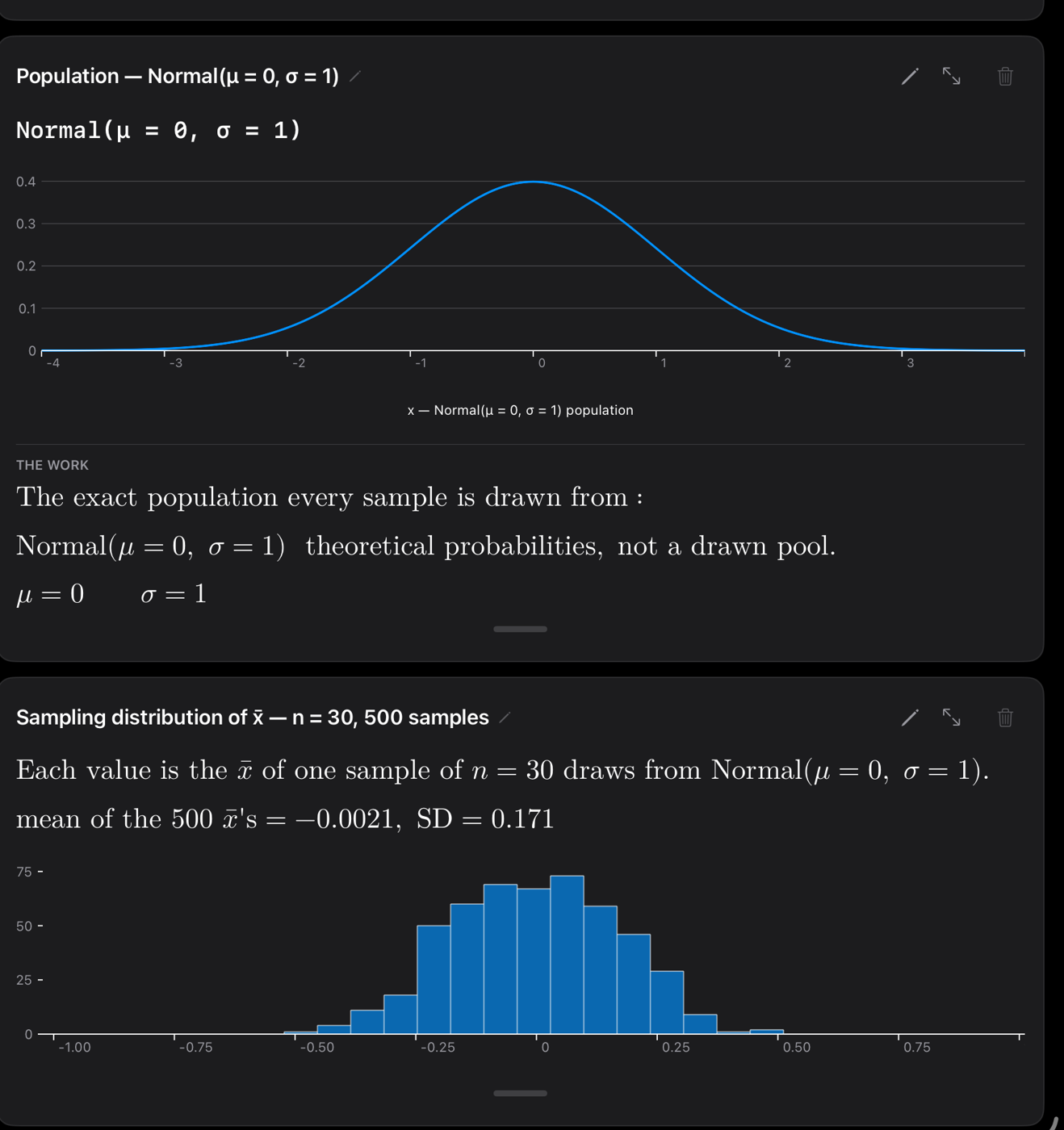
Sampling distributions, simulated for real: 500 sample means from a population you chose.
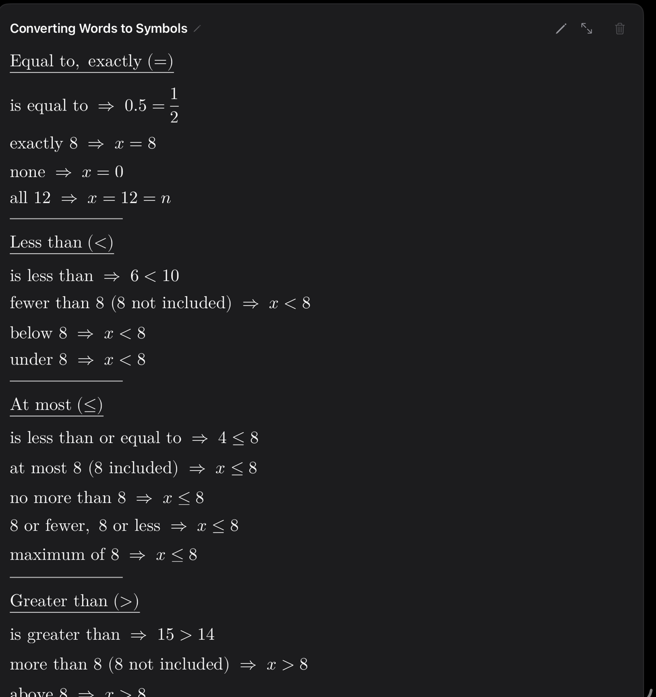
Words to symbols: "at most", "fewer than", "more than" — translated, with examples.
On iPad the calculator and the results sit side by side. Open the Distributions panel, set the bounds, and the worked card lands next to your keypad — curve, live z-table and all. Then pick up your Apple Pencil: every result card stretches open to give you blank writing room right beneath the mathematics, so you can work the next step by hand without leaving the problem. Your writing stays glued to that card, at any zoom.
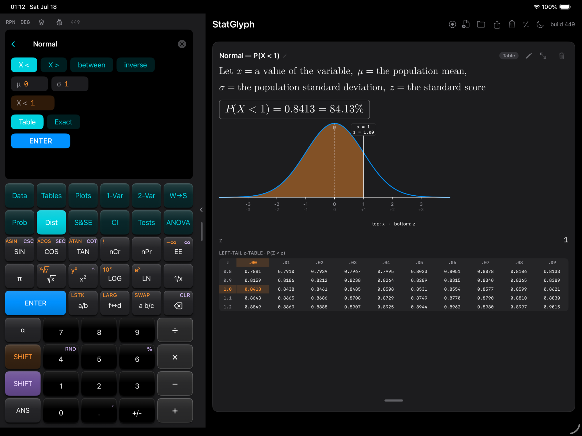
iPad, landscape: the Normal panel on the left; the worked card, its z-table, and Pencil writing room stretched open on the right.
StatGlyph on the Mac is a real Mac app, not a port of the phone screen. The whole keypad is mapped to your keyboard — digits, operators, and the shifted function layers — so a homework session never makes you reach for the trackpad. It follows your system light and dark appearance, and the results feed folds away when all you want is the calculator.
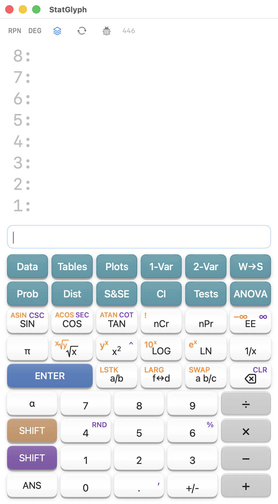
The native Mac window, light appearance.
Data tables, plots, 1-variable and 2-variable summaries, probability, distributions, sampling & standard error, confidence intervals, hypothesis tests, and ANOVA — each behind its own key.
The a b/c key types mixed numbers the way they are written by hand. Results reduce automatically, and one key flips a fraction between mixed, improper, and decimal form.
Normal, binomial, and friends draw their curves with the probability region shaded, and show the matching table row — so the picture and the table stop being separate skills.
Trig with inverse and reciprocal functions, logs, powers, roots, scientific notation, and a visible RPN stack that keeps your last results in reach.
Worked cards are set in proper mathematical notation — fractions, radicals, summations — not calculator shorthand.
StatGlyph works entirely on your device. No account, no sign-in, nothing sent anywhere. It behaves like a calculator, because it is one.